New Season
(Personal Project)
Overview
New Season is an e-commerce platform showcasing the top 5 trending sneakers, along with a statistics page that highlights popular brands, models, and customer satisfaction. I designed a user-friendly website with a straightforward checkout process and an integrated dashboard to help users make informed decisions
Role
UX Designer, UI Designer, Researcher, UX/UI Developer, Front-end Developer
Tools
Figma, Adobe Photoshop, Canva
Languages
JavaScript, HTML, CSS, Chart.js
Timeline
May 2024 - August 2024
Challenge
Shoe shopping online can feel overwhelming with so many options and conflicting recommendations from articles, TikTok videos, and other sources. It’s easy for users to experience decision fatigue when trying to figure out what’s truly trending. New Season solves this by curating a list of the top 5 trending sneakers, backed by reliable stats, and offering a straightforward, user-friendly shopping experience
Solution
New Season is an e-commerce website that showcases the top 5 trending shoes, simplifying the research process and letting users purchase directly from the site to save time and effort
Preliminary Research
Research and Planning
I conducted qualitative user research to understand the pain points and needs of shoe shoppers. The research method included conducting one-on-one interviews with the target demographic to understand their shoe shopping behaviors and preferences. Key questions asked during the interviews included:
"Where do you find the top trending shoes?"
"What do you look for when buying trending shoes?"
"How do you decide which shoes to purchase?"
"What frustrations do you encounter when shopping for shoes online?"
Key Findings
Users primarily rely on social media platforms like TikTok, Instagram, and Pinterest to discover trending shoes
They search for keywords like "shoes" and engage with videos, posts, and influencer recommendations to identify popular trends
Many users mentioned they "keep an eye out" for repeated mentions of certain shoes across platforms to gauge consistency
Some users prefer browsing multiple websites and articles to gather information but find it challenging to sift through vast amounts of content for reliable recommendations
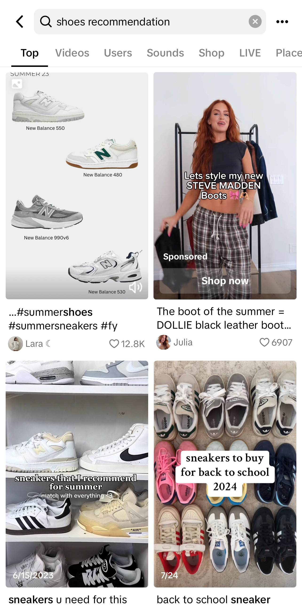
TikTok "Shoes Recommendations"
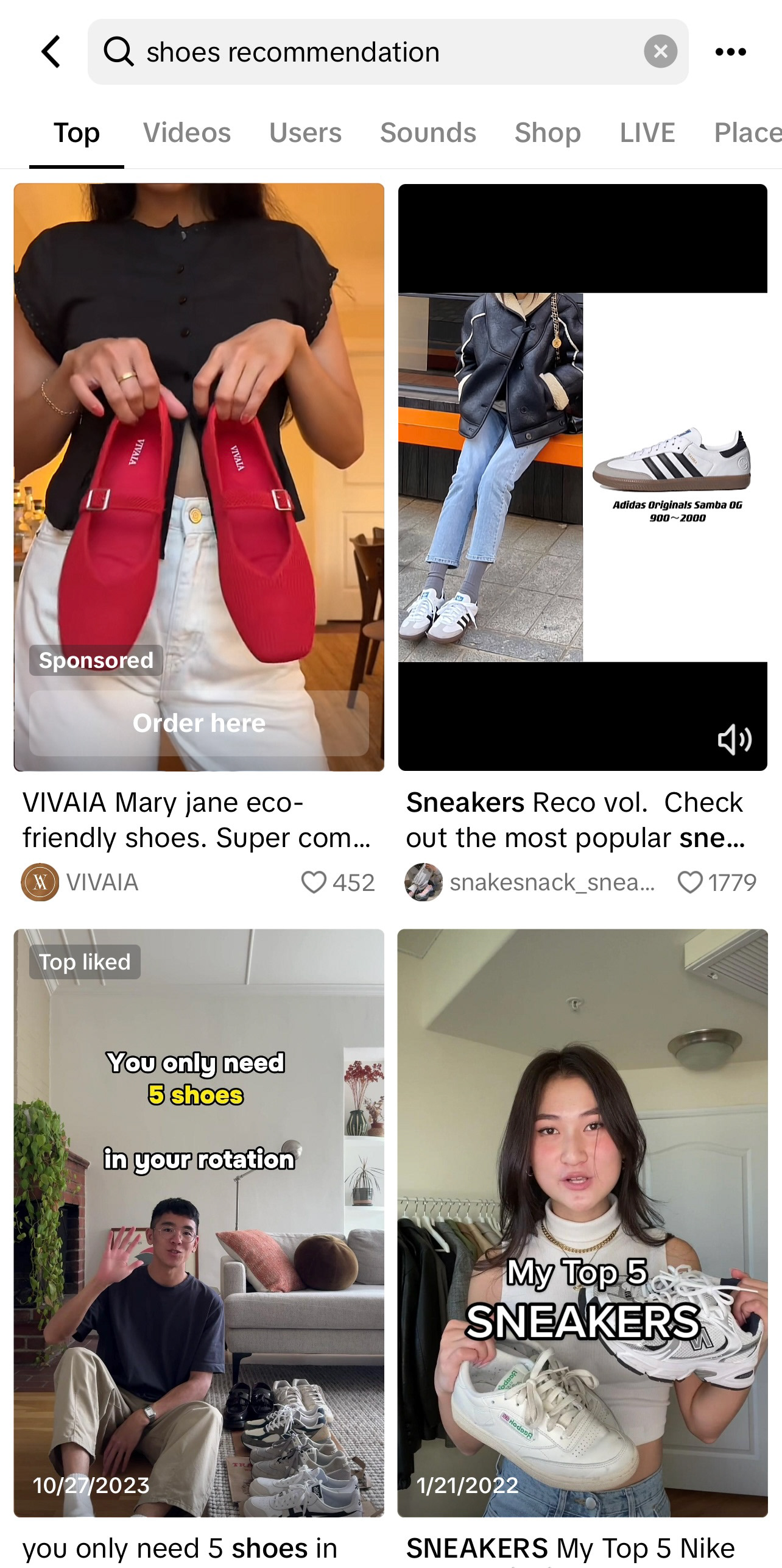
TikTok "Shoes Recommendations"
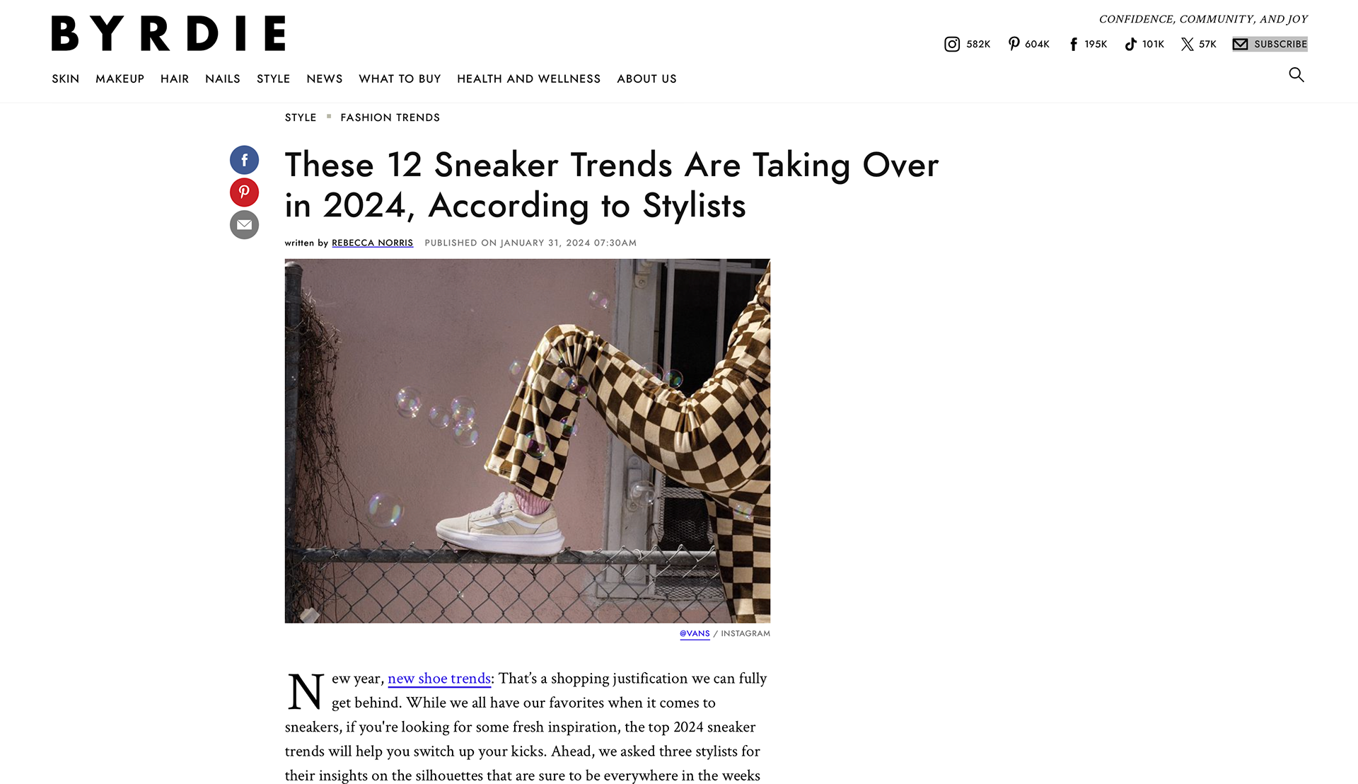
https://www.byrdie.com/2024-sneaker-trends-8547977
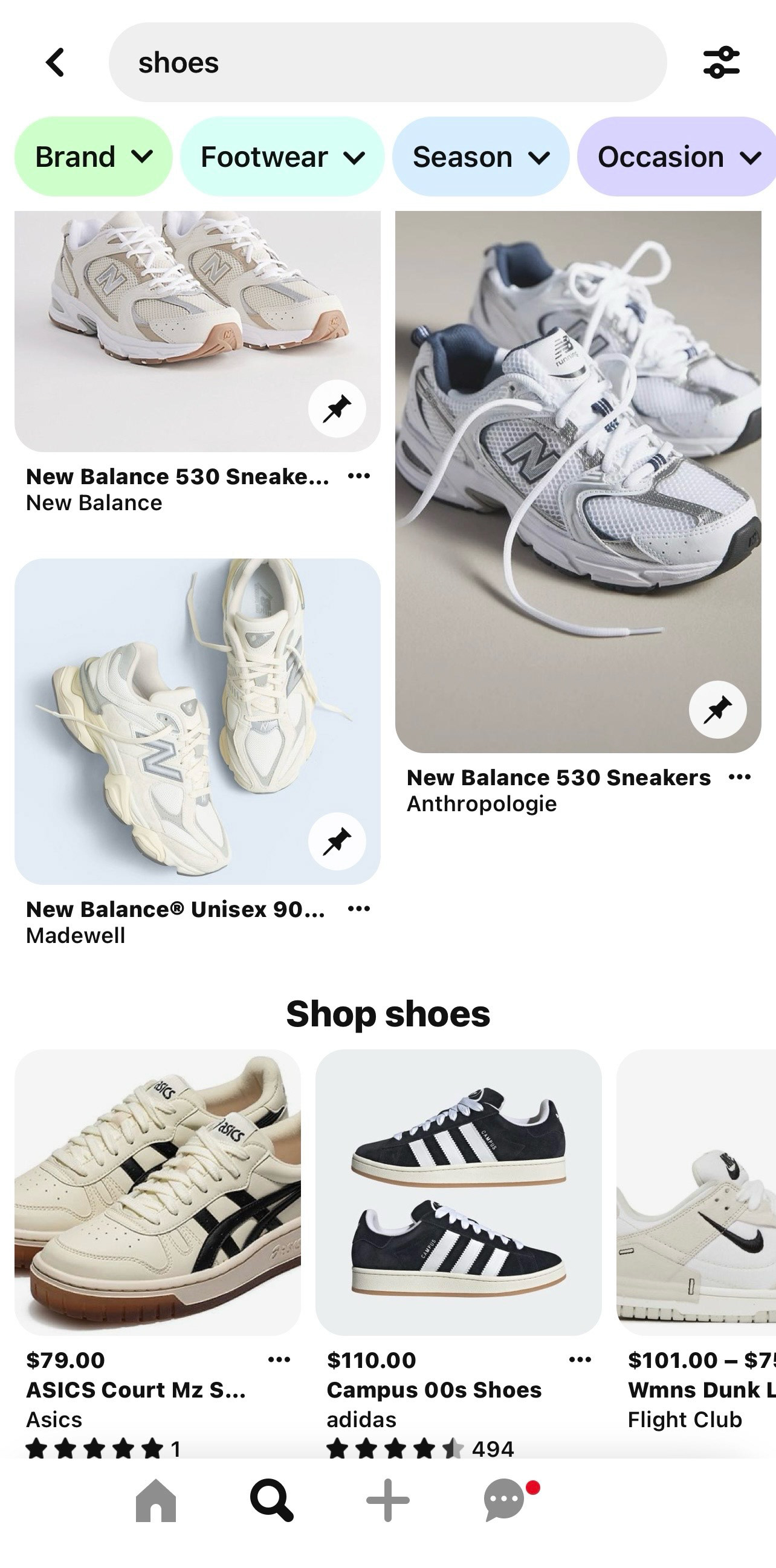
Pinterest "Shoes"

https://www.flexdog.com/magazine/top-10-hottest-sneaker-trends-for-2024
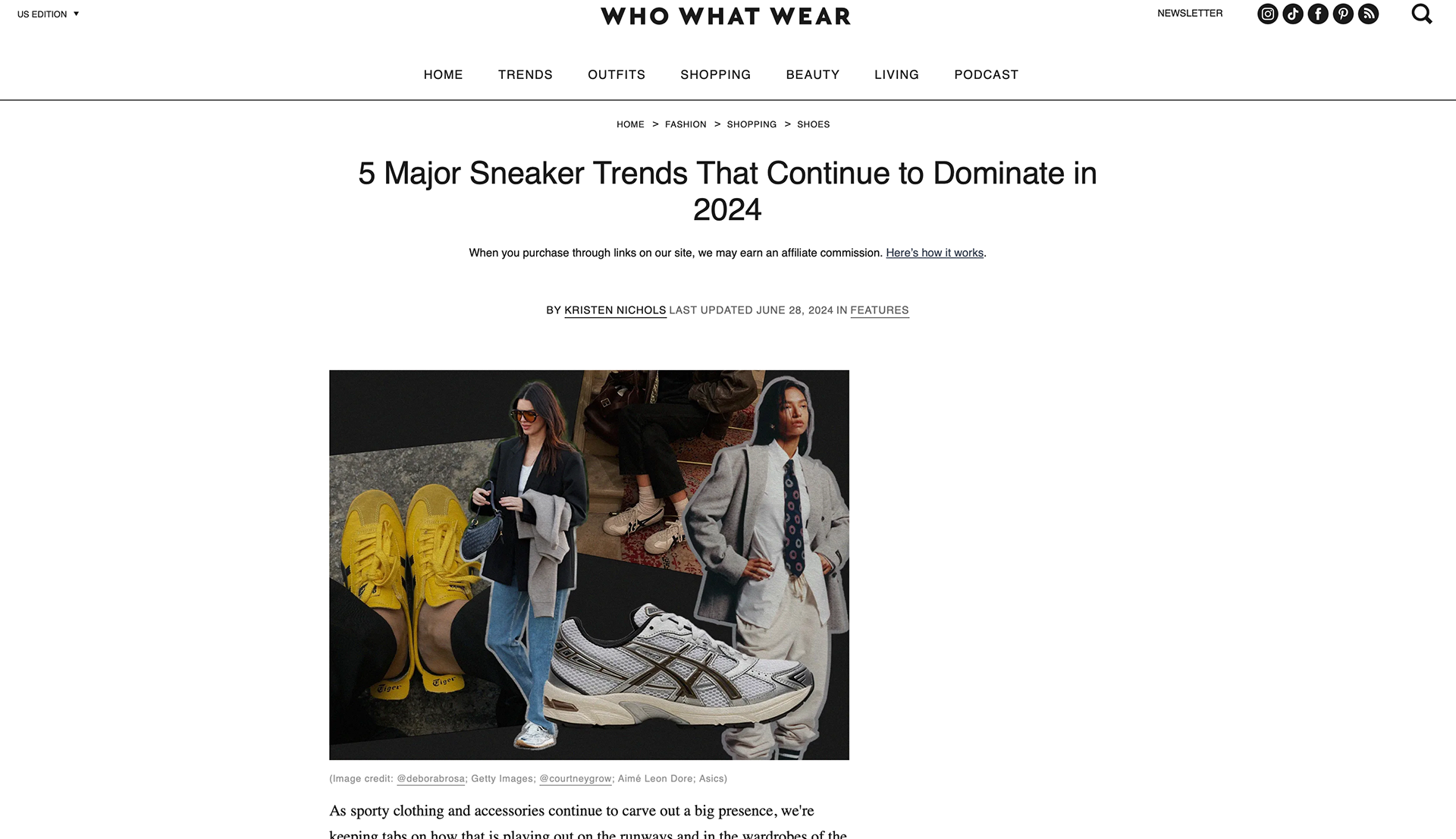
https://www.whowhatwear.com/sneaker-trends-2024
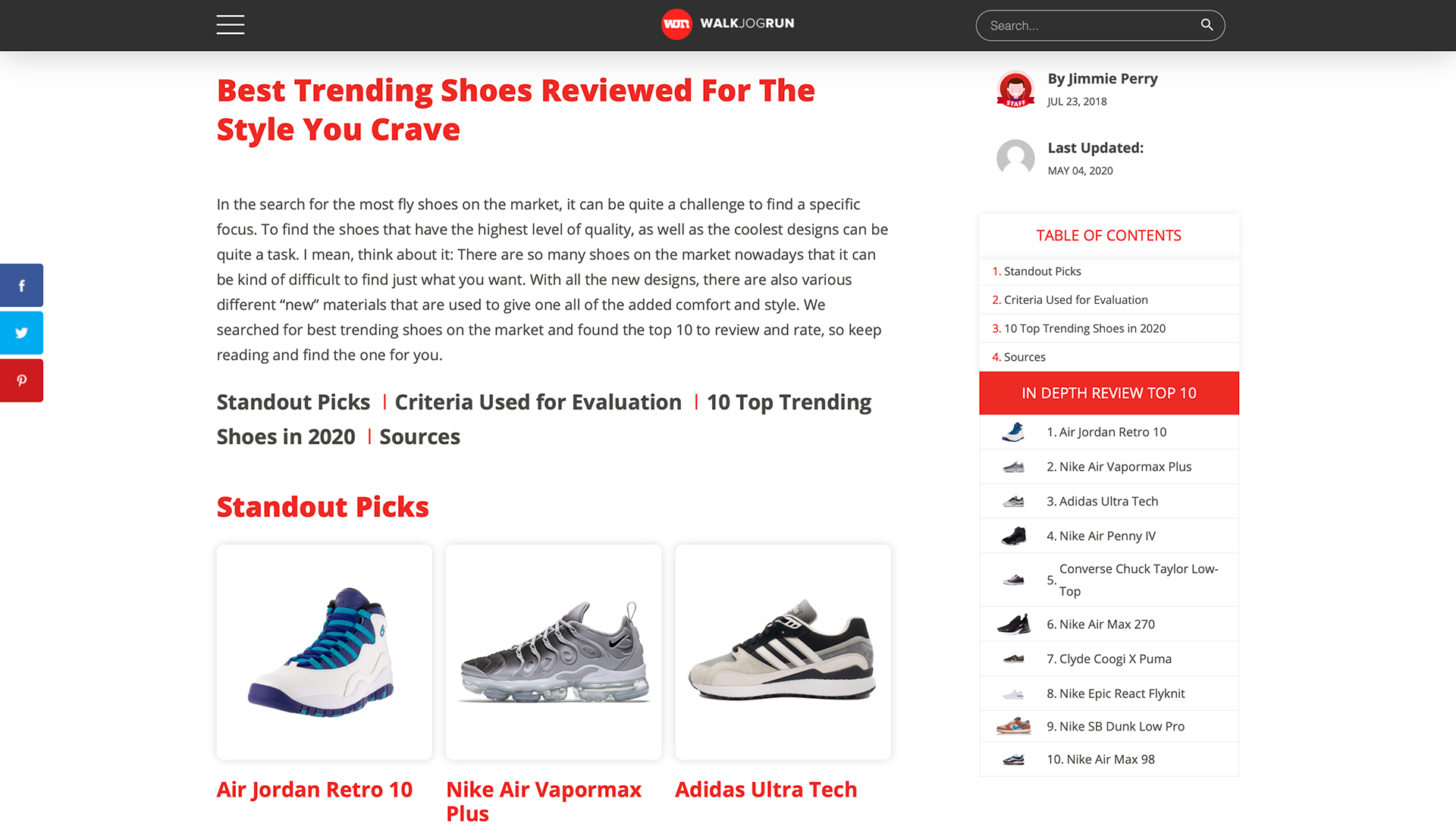
https://www.walkjogrun.net/best-trending-shoes-reviewed/
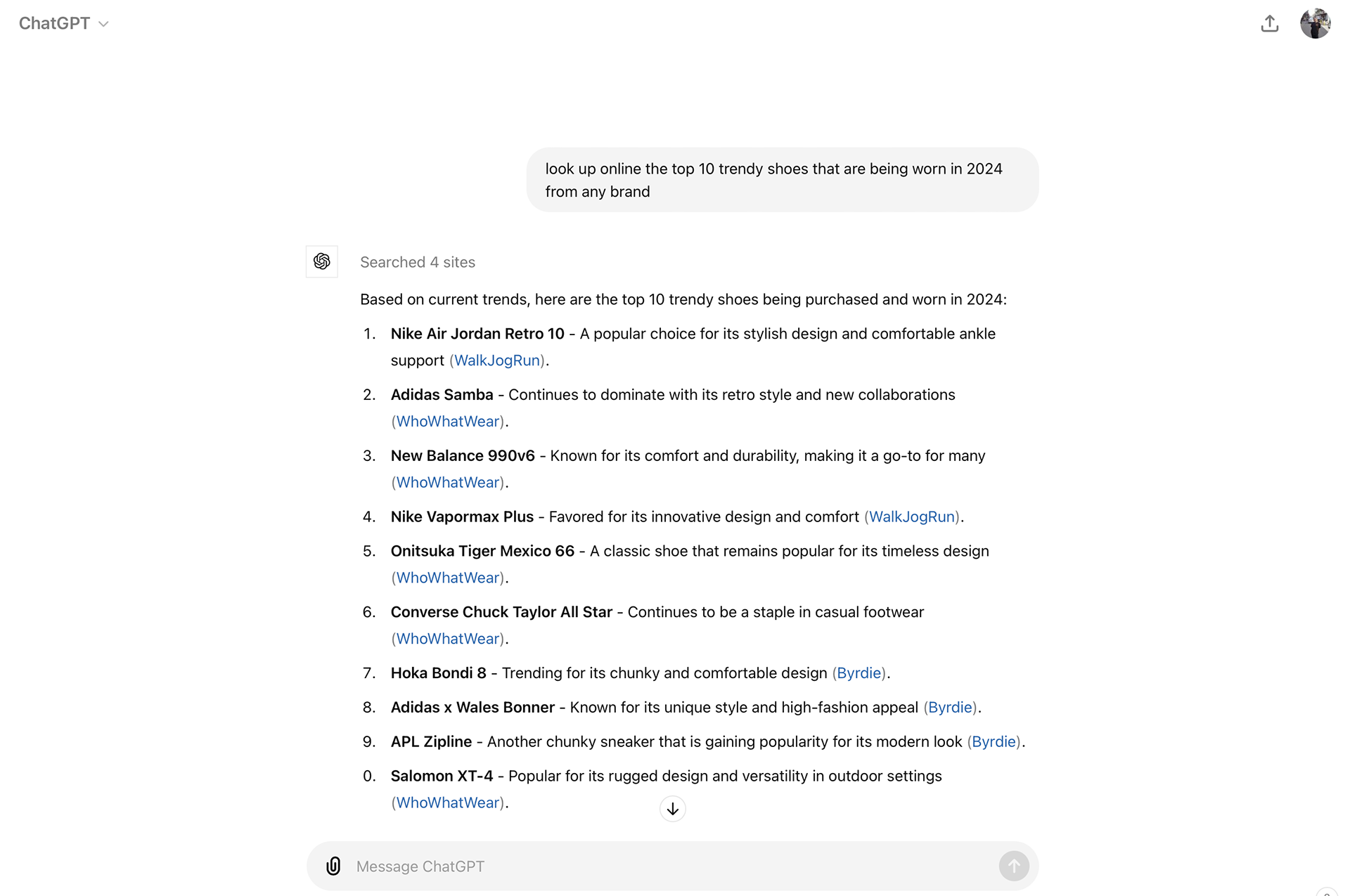
https://chatgpt.com
Target Audience
New Season’s target audience includes trend-conscious males and females aged 16 to early 30s who value staying updated on the latest footwear trends. Active on social media, they’re often influenced by visual content, influencers, and social proof, leading to spontaneous purchases. They appreciate efficient, trustworthy shopping experiences with curated selections that save time and simplify decision-making.
User Personas
Style-Seeking Shane
Background: Shane is an 18-year-old fashion enthusiast focused on staying ahead of sneaker trends. Social media is his go-to for keeping his wardrobe fresh, but the sheer volume of options online often leaves him unsure of what’s truly popular. Shane’s love for fashion and his desire to stand out among friends drive his search for the latest sneakers, though navigating the overwhelming number of choices adds to his frustration
Goals: Stay updated with the latest sneaker trends and be recognized for his fashion choices
Motivations: Influenced by social media and the desire to maintain a trendy wardrobe
Frustrations: Overwhelmed by the number of options available online; finds it difficult to trust which shoes are truly trending
Efficient Ellie
Background: Ellie is a 22-year-old who values her time and relies on trusted sources to guide her decisions. She avoids spending hours browsing and prefers to quickly find the best trending shoes so she can make her purchase and get back to her day. Ellie often feels frustrated by the overwhelming and conflicting information online, which makes her cautious about her choices. She seeks a streamlined shopping experience that offers clarity and efficiency
Goals: Find the best trending shoes quickly and make a purchase without having to browse through countless options
Motivations: Seeks efficiency and relies on trusted sources to make quick purchasing decisions
Frustrations: Dislikes spending too much time shopping online; often confused by conflicting information from different sources
Design Process
Ideation and Brainstorming
I drew inspiration from Behance, Dribbble, and Webflow, creating a mood board to align with New Season’s brand identity. By experimenting with layouts, colors, and interactions, I developed a cohesive and visually appealing design.
User Flow Diagram
To ensure a seamless user journey, I created a User Flow Diagram that outlines the steps users take to navigate from discovering the trending shoes on the landing page to completing a purchase. This diagram was crucial in identifying potential pain points and optimizing the flow for efficiency.
Sitemap Diagram
To establish a clear structure for the website, I developed a Sitemap Diagram. This sitemap served as the blueprint for organizing the website's content and ensuring that users could easily navigate between pages. It also helped in identifying the key sections that needed to be included, such as the landing page, statistics page, and checkout page.
Wireframing and Prototyping
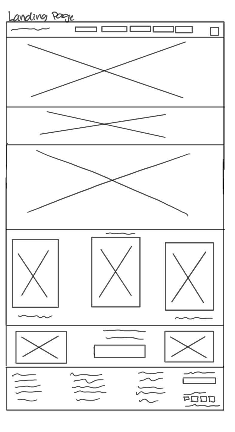
For the landing page, I began by digitally sketching three digital low-fidelity wireframes. These wireframes allowed me to explore different layout possibilities and think critically about how best to organize and present key information. The low-fidelity approach helped in quickly iterating on ideas without getting bogged down in details, allowing me to focus on the overall structure and user flow. By comparing these wireframes, I could assess which layout would be most effective in capturing user attention and guiding them through the content efficiently.
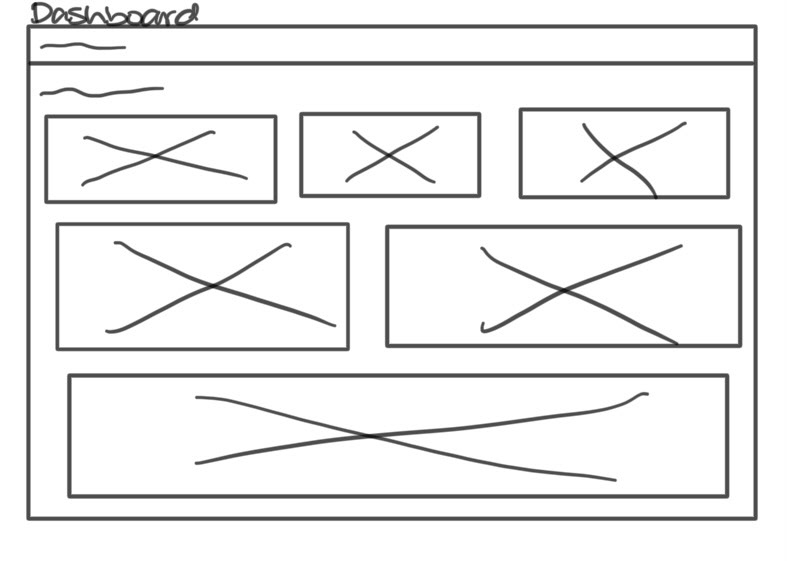
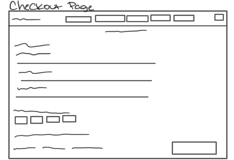
Next, I transitioned to the checkout page, where I sketched four low-fidelity wireframes on a whiteboard. This process allowed me to explore various layout options for a critical part of the user journey. Whiteboarding gave me the flexibility to experiment with different arrangements and understand how users might interact with the page. The goal was to create a layout that simplified the checkout process, minimized friction, and ensured a smooth transition from browsing to purchasing.
Style Guide/UI Kit
The New Season style guide defines the visual and interactive elements that ensure consistency across the entire website. This kit includes a cohesive color palette, typography choices, button styles, iconography, and other necessary components that reflect the brand’s modern and trendy aesthetic. Each component was meticulously crafted to enhance user experience, from hover effects on buttons to the responsive layout grid. The style guide also outlines best practices for implementing these elements, ensuring that every interaction is intuitive and visually appealing.
Using Figma, I developed high-fidelity prototypes that closely resembled the final product. In this stage, I paid particular attention to aesthetics, ensuring the visual design aligned with the overall brand and was appealing to the target audience. Additionally, I focused on refining the user flow and functionality, making sure the prototypes not only looked good but also provided a seamless and intuitive user experience.
These prototypes were instrumental in bringing the concept to life, allowing for detailed usability testing and providing a clear vision for the final design.

Fitts's Law Implications
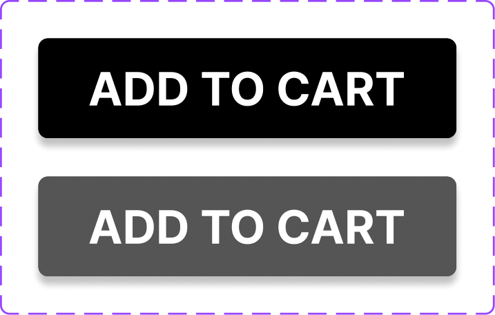
In the New Season project, Fitts's Law played a crucial role in optimizing the user experience. By strategically designing the interface, I ensured that key interactive elements, such as the "Buy Now" and "Add to Cart" buttons, were large and easily accessible. These buttons were intentionally placed near the product information to reduce the distance users needed to move their cursor, thereby minimizing the time and effort required to complete an action. Additionally, the navigation bar's layout was designed with larger click areas for the brand names, making it easier and faster for users to switch between different shoe options. This application of Fitts's Law helped create a more efficient and user-friendly shopping experience.

Hick's Law Implications
In the New Season project, Hick's Law guided the design decisions to streamline user interactions and reduce cognitive load. By limiting the number of choices on the landing page, such as displaying only the top five trending brands, I minimized the time users needed to make a selection. This approach ensured that users could quickly navigate the site and make purchasing decisions without feeling overwhelmed by too many options. Additionally, the checkout process was simplified, with clear and concise steps, further adhering to Hick's Law to create an efficient and user-friendly experience.
I applied Fitt's Law and Hick's Law to guide my design decisions, focusing on optimizing the user experience. These principles informed how I structured interactive elements and minimized user decision-making time, ensuring a more intuitive and efficient interaction. By leveraging these laws, I was able to create a design that not only looks appealing but also functions seamlessly, reinforcing my approach to delivering a user-centric product.
Usability Testing
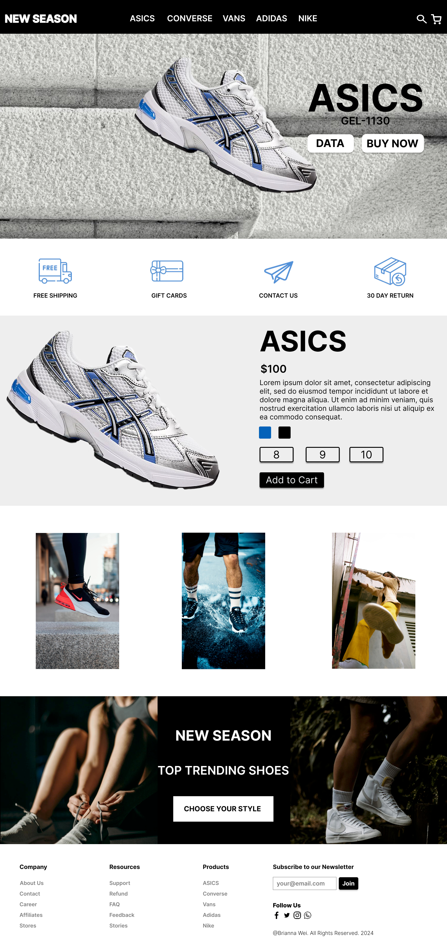
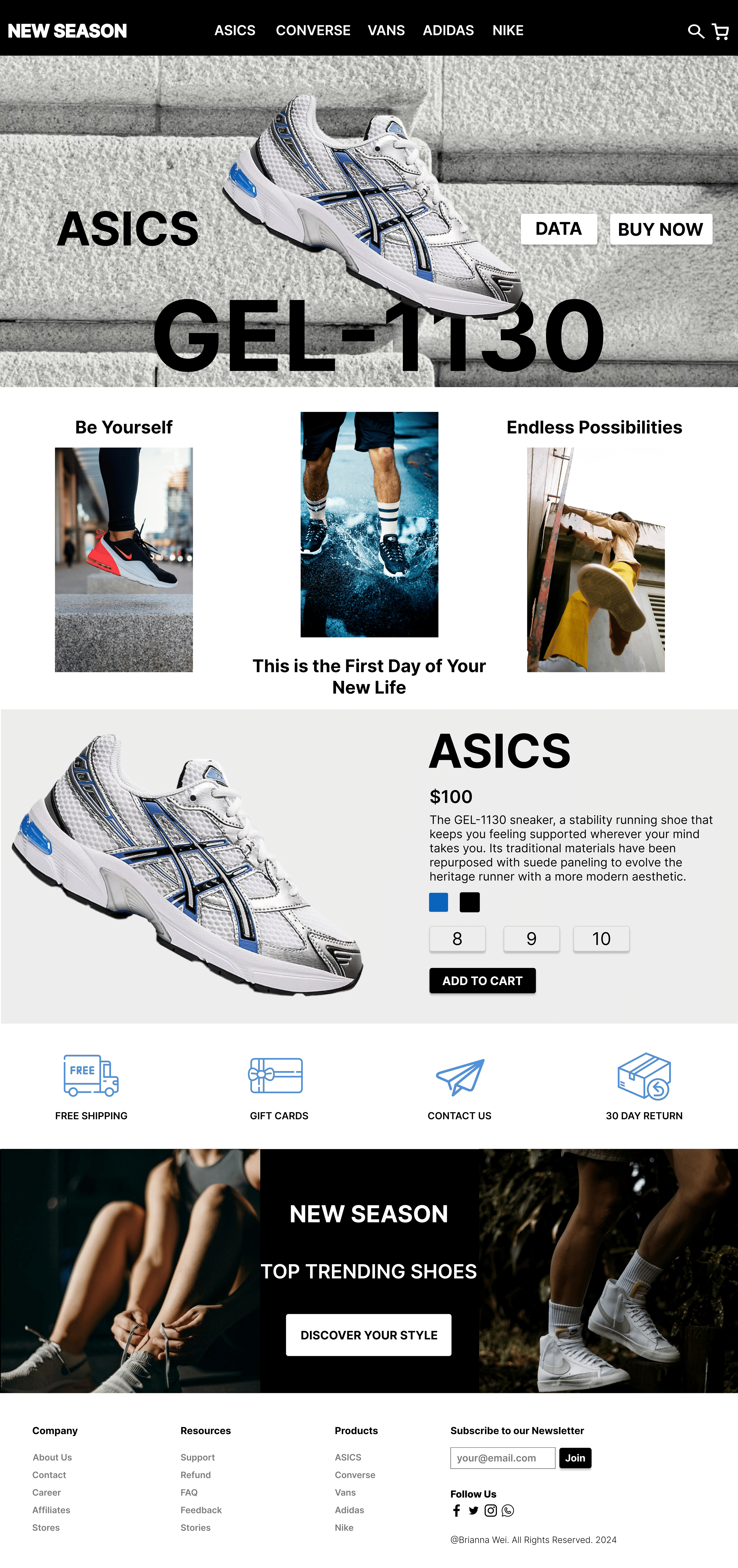
I conducted usability testing by revisiting the users I interviewed during the research phase. I presented them with the potential designs for the landing page and checkout page. The feedback included the importance of including the shoe model names prominently on the site, as this detail is crucial for users when deciding which shoes to purchase. Users also provided insights on the layout, suggesting that certain sections should be repositioned to reflect the significance of the information. For the checkout page, users requested more balanced spacing and expressed a preference for a cleaner design with fewer unnecessary details. They also recommended a more cohesive color scheme for the statistics dashboard.
Iterations and Refinements
Based on the feedback, I made several key adjustments:
For the landing page, I highlighted the shoe model names to ensure they were easily visible and adjusted the layout to create a clearer hierarchy of information. The layout was reorganized to emphasize the most important content, making the user journey more intuitive and efficient.
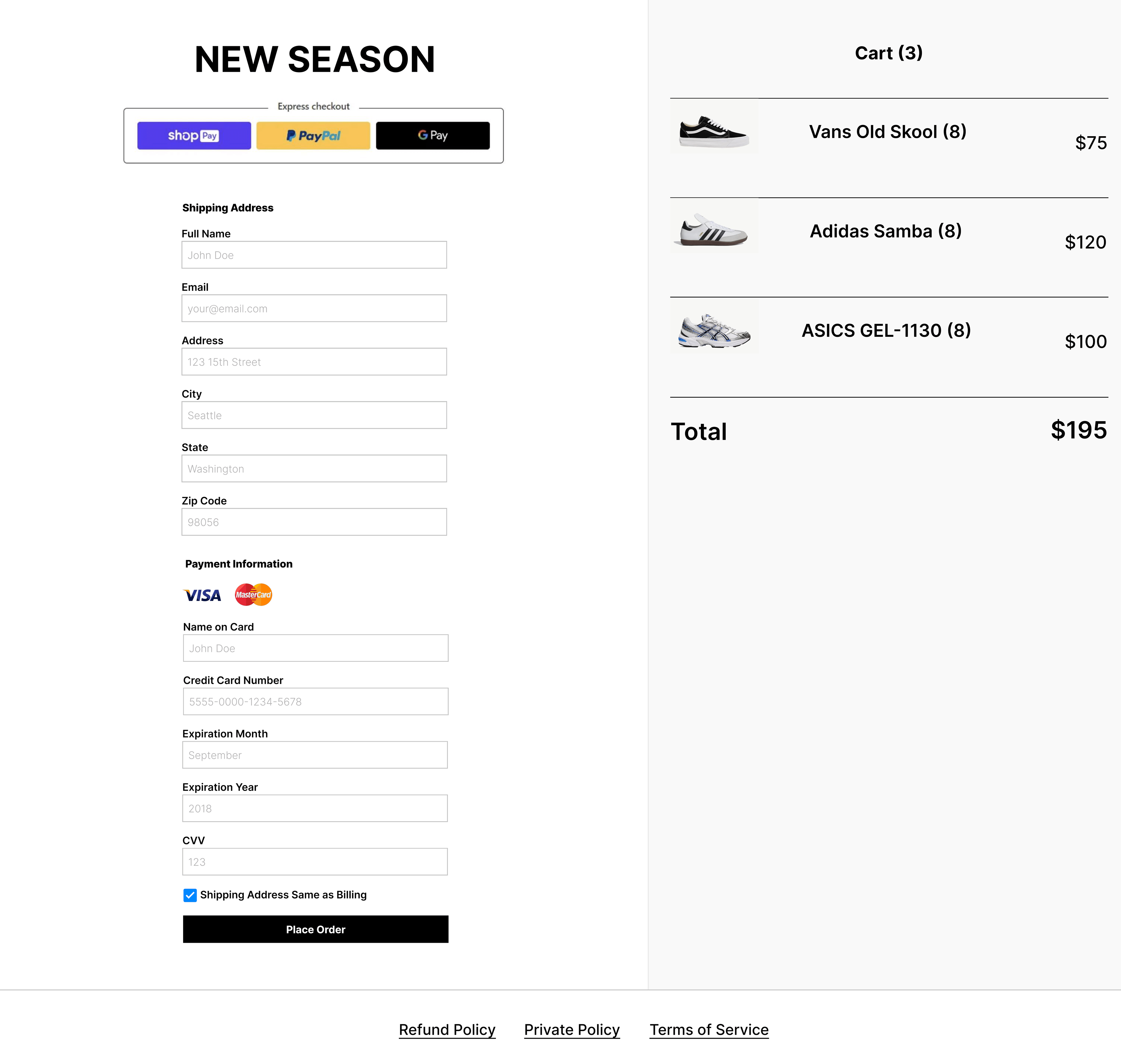
For the Checkout page, I redistributed the spacing and simplified the design by removing extraneous details. This made the page more user-friendly and visually appealing.


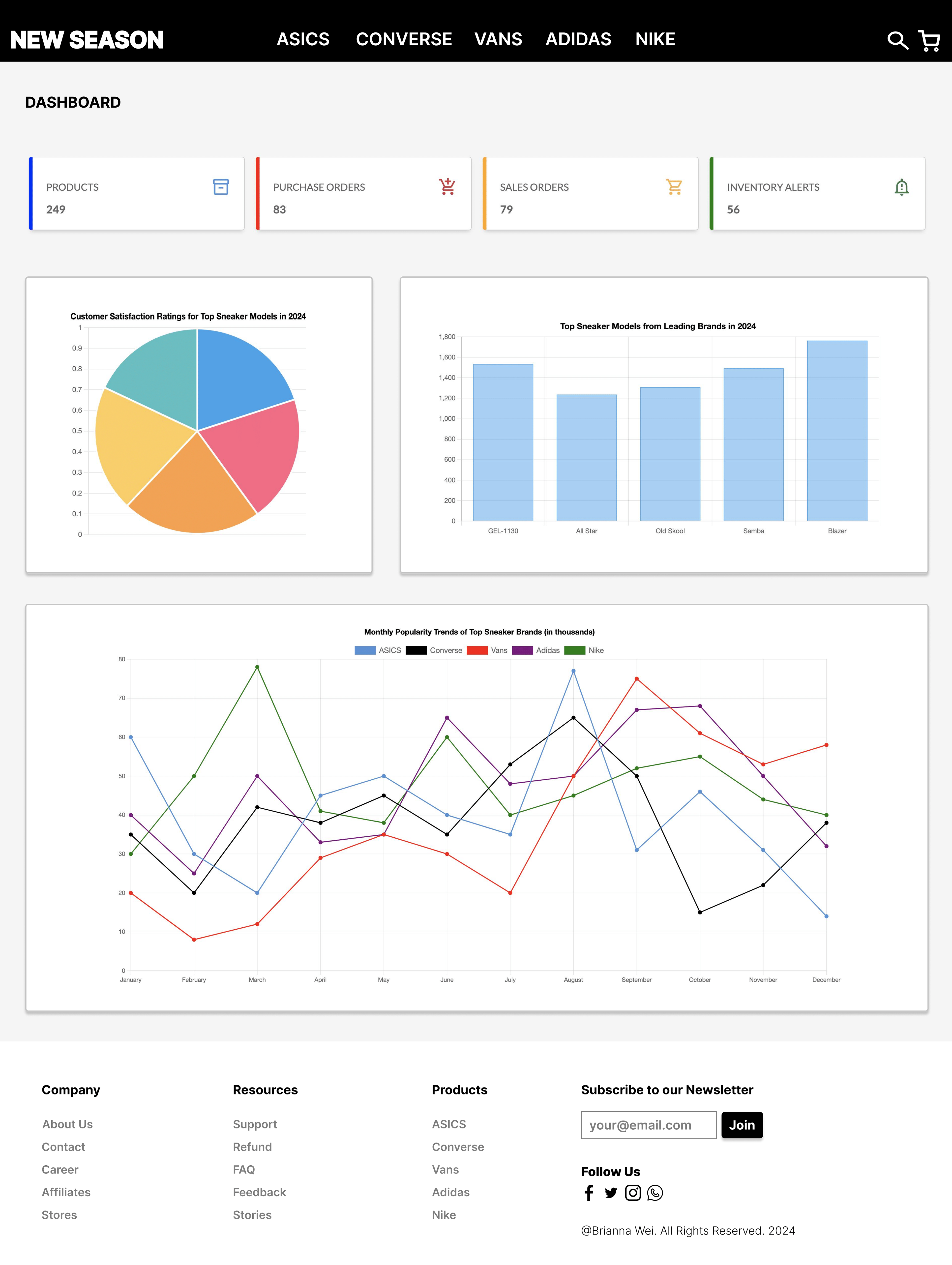
For the Statistics Dashboard, I applied a consistent color scheme, using blue from the Style guide/UI Kit, to enhance visual cohesion and create a more polished look.

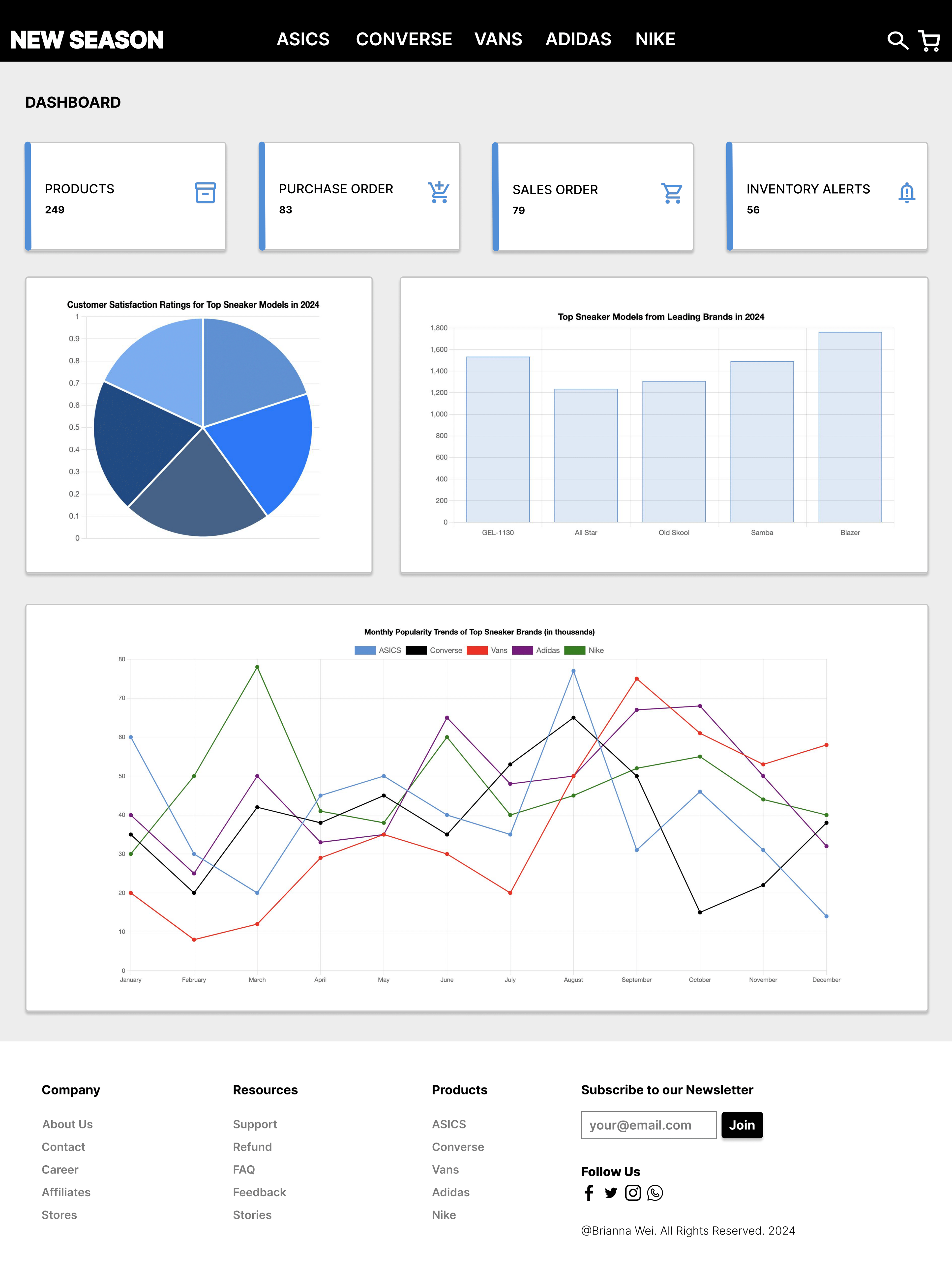
These refinements not only improved the visual appeal of the website but also made it easier for users to navigate and find the information they needed. The user journey was streamlined, and the overall experience was more satisfying and efficient.
Result
The final design for "New Season" embodies the vision of creating a user-friendly, aesthetically pleasing platform that simplifies the process of discovering and purchasing trending shoes. After extensive user research, wireframing, prototyping, and usability testing, I refined the design to ensure it met the needs and expectations of the target demographic. The website features a clean and modern interface, intuitive navigation, and seamless functionality, making it easy for users to explore top brands and models.
After developing high-fidelity prototypes using Figma, I conducted several rounds of usability testing to gather feedback on the design's functionality and user experience. The feedback was instrumental in fine-tuning the visual hierarchy, improving navigation, and ensuring that the overall user flow was smooth and intuitive. Key changes included the addition of model names on product pages, adjustments to the information hierarchy, and a more consistent color scheme across the dashboard.
Laptop-Friendly View
Mobile-Friendly View
Front-End Development
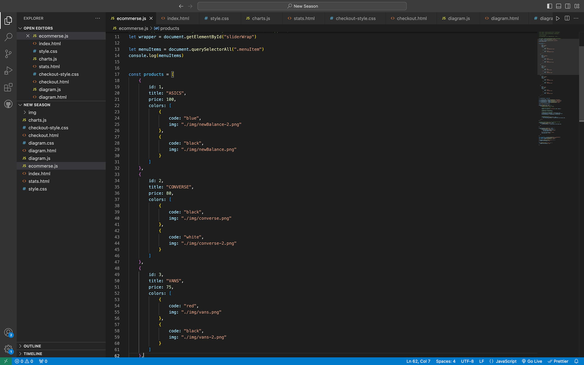
Once the final design was solidified, I transitioned from prototyping to development. Using my skills in JavaScript, HTML, and CSS, I brought the design to life by coding the website's front-end. I ensured that the site was responsive, accessible, and optimized for performance. The end result was an interactive and dynamic platform that allows users to easily browse, select, and purchase trending shoes, with all the visual and functional elements working seamlessly together.
In addition to implementing the foundational front-end development elements, I introduced a dynamic slider effect for the navigation bar. When a user clicks on a brand name, the entire display—comprising the brand name, model name, shoe image, and associated buttons—shifts smoothly to showcase the selected shoe. This interactive transition not only adds a layer of sophistication to the user experience but also ensures seamless navigation between different shoe brands.
For the dashboard, I experimented with Chart.js for the first time to create interactive data visualizations. These include pie, bar, and line charts that allow users to hover over specific elements, triggering information bubbles that provide precise statistics. This interactivity makes the data more accessible and comprehensible, enhancing the overall functionality of the dashboard.


Takeaways
Overall, I learned a great deal about the value of thorough research and the importance of usability testing in achieving better design outcomes. These practices allowed me to refine the user experience and create a more effective and user-friendly design. It was also crucial in taking my initial idea from concept through to a fully developed product. The process of bringing my vision to life—from ideation to design and finally to the development and finishing stages—has been incredibly rewarding.
As I look toward future enhancements, I plan to create a dedicated purchasing page for a more streamlined shopping experience. Additionally, I aim to incorporate features such as user accounts that notify users via email or text message when their favorite brands become trending. I’m also excited to explore backend coding and API integration to (GET) automate the data in my charts, ensuring they are always up-to-date without manual input.
I also want to expand the scope of New Season to include various types of shoes beyond sneakers, such as trending sandals, dress shoes, and boots. This expansion could also consider seasonal trends (fall, winter, spring, summer) and cater to different demographics, offering a more comprehensive and personalized shopping experience.
All in all, this project has laid a solid foundation for me as a UI/UX Designer, UX Researcher, Usability Tester, and Front-End Developer, and I’m eager to build upon it with these upcoming developments.