EnkUn
(UI/UX Designer)
Overview
This case study delves into the redesign of the landing page for EnkUn, a digital learning platform aimed at empowering refugees through accessible education. Tasked with transforming an incomplete and unstructured page, I leveraged UX Best Practices and Web Accessibility Standards (WCAG) to create a more intuitive, engaging, and accessible user experience. The result was a redesigned landing page that effectively communicated EnkUn’s mission and significantly improved user engagement and accessibility.
Role
UI/UX Designer
Tools
Figma, Adobe Photoshop, Canva, Infomaniak
Timeline
July 2022 - September 2022
Challenge
The initial landing page of EnkUn was incomplete, lacking structure, storytelling, and visual appeal. It did not effectively communicate the mission or value proposition of the company. The goal was to redesign the landing page to make it more compelling for visitors, encouraging them to explore and engage with the platform.
Solution
To overcome the challenges, I redesigned the EnkUn landing page to better communicate the company’s mission and value. The new design features a clear, logical flow of information, making it easier for users to understand and navigate the site. The result is a more streamlined and engaging experience that effectively represents EnkUn’s vision.
Preliminary Findings
Target Audience
The target audience for the EnkUn landing page includes refugees seeking accessible digital learning opportunities and support organizations working to empower these communities. Given the diverse backgrounds and varying levels of digital literacy among users, the design needed to be intuitive and welcoming. The goal was to ensure that all users, regardless of their language proficiency or technical skills, could easily navigate the site and understand EnkUn’s offerings. Additionally, accessibility was paramount, considering that some users might have disabilities or limited access to technology. By focusing on inclusivity and clarity, the redesign aimed to meet the needs of a broad and diverse audience.
User Personas
Focused Fatima (29, Female)
Location: Berlin, Germany
Background: Fatima fled Syria with her two children and now resides in a refugee community in Berlin. She holds a degree in Education from a university in Damascus but has struggled to find employment in her field due to language barriers and the need to adapt her skills to the German job market. Fatima is eager to improve her German and gain certifications that would make her more employable.
Goals: Learn German to a proficient level to improve communication in daily life and work. Obtain certifications in digital education and teaching methods that are recognized in Germany. Secure a teaching position in Berlin’s school system to support her family.
Frustrations: Difficulty finding affordable and accessible educational resources that align with her career goals. Lack of guidance on how to translate her existing qualifications to the German job market. Feeling isolated and overwhelmed by the complexity of navigating a new education system.
Needs: A platform that offers structured, language-adaptive courses that cater to her specific needs as an aspiring teacher. Access to career counseling or mentorship to help her navigate the German education system and job market. A community feature that connects her with other refugees pursuing similar goals for mutual support and motivation.
Determined Dimitrios (22, Male)
Location: Athens, Greece
Background: Ahmed fled Afghanistan due to ongoing conflict and now lives in a refugee camp in Athens. He had to leave behind his studies in computer science and is keen to continue his education, particularly in web development. Ahmed has basic knowledge of English and is self-taught in some programming languages, but he lacks formal certification and structured learning opportunities.
Goals: Continue his education in computer science, with a focus on web development. Obtain certifications that will enable him to pursue remote work or further studies in Europe. Build a portfolio of work that demonstrates his skills to potential employers or educational institutions. Frustrations: Limited access to reliable internet and educational resources in the refugee camp. Difficulty in finding courses that match his existing knowledge level and learning pace. Lack of recognition for the informal education he has already undertaken, making it hard to demonstrate his skills.
Needs: A platform that provides flexible, online courses in web development, tailored to refugees with limited resources. Opportunities to earn recognized certifications that can boost his employment prospects. A portfolio-building tool or feature that helps him showcase his skills to potential employers or academic institutions.
Design Process
Ideation and Brainstorming
When tasked with creating a landing page for EnkUn, I chose not to simply refine the unfinished version provided but to reimagine it entirely. I began by analyzing the existing elements for inspiration, which guided my brainstorming process. With a clear understanding of EnkUn’s target audience—refugees seeking digital learning opportunities—I focused on how best to communicate the platform’s mission. The ideation phase involved sketching out initial concepts, considering how to present information clearly, engagingly, and accessibly. I aimed to integrate UX Best Practices, such as intuitive navigation and clear calls to action, to ensure a seamless user experience.
Sitemap Diagram
This sitemap outlines the future vision for the EnkUn website, developed in collaboration with the team. It features a user-friendly structure with clear navigation to key areas like the Refugees and Mentors pages, language options, and essential calls to action, such as the Demo and Join pages. The design prioritizes accessibility and aims to create an engaging experience for users, particularly refugees, ensuring they can easily access learning opportunities and information about EnkUn.
Style Guide/UI Kit
To maintain consistency across the landing page, I developed a style guide/UI kit. This guide included color schemes, typography, button styles, and iconography, all designed with accessibility in mind. High-contrast color combinations were selected to aid readability, especially for users with visual impairments. Typography choices were made to ensure clarity and legibility, with a focus on ease of reading for users with dyslexia or other reading difficulties. The UI kit also included WCAG-compliant icons and imagery, ensuring that the design was not only visually appealing but also inclusive and accessible to all users.
Wireframing and Prototyping
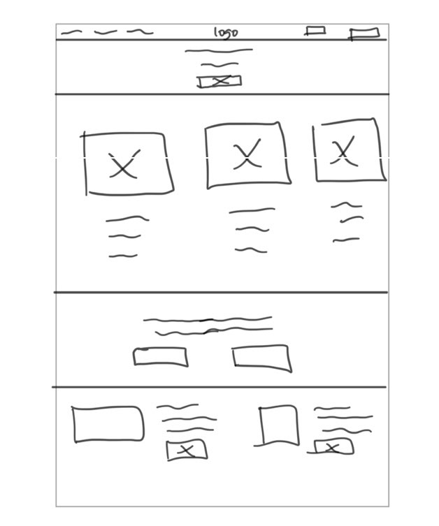
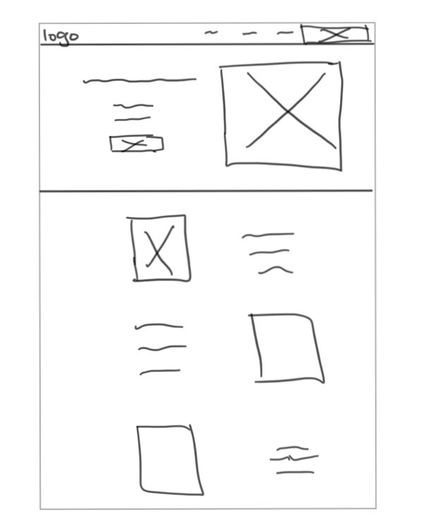
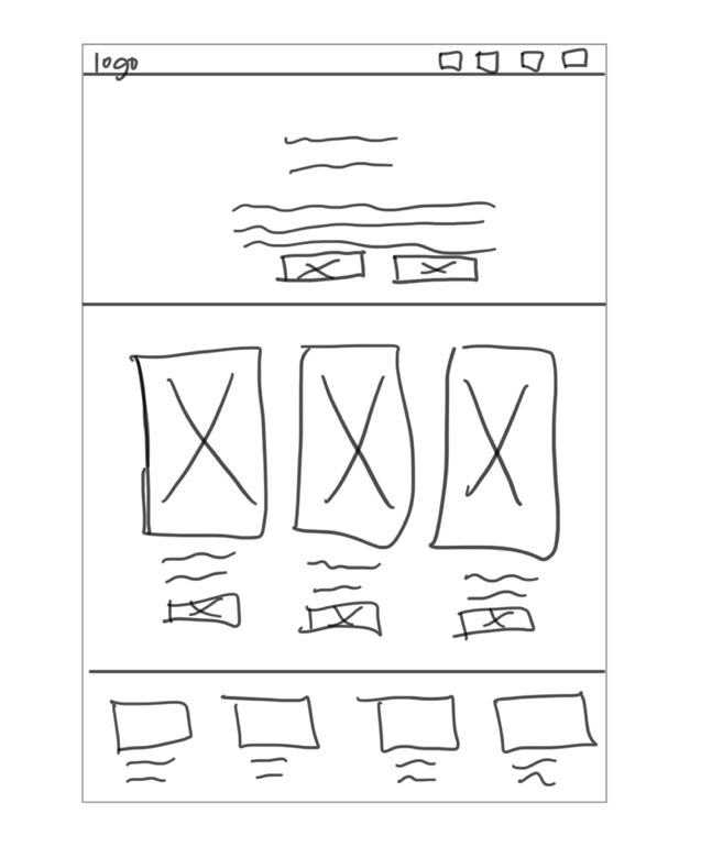
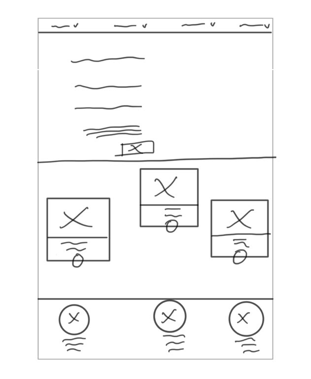
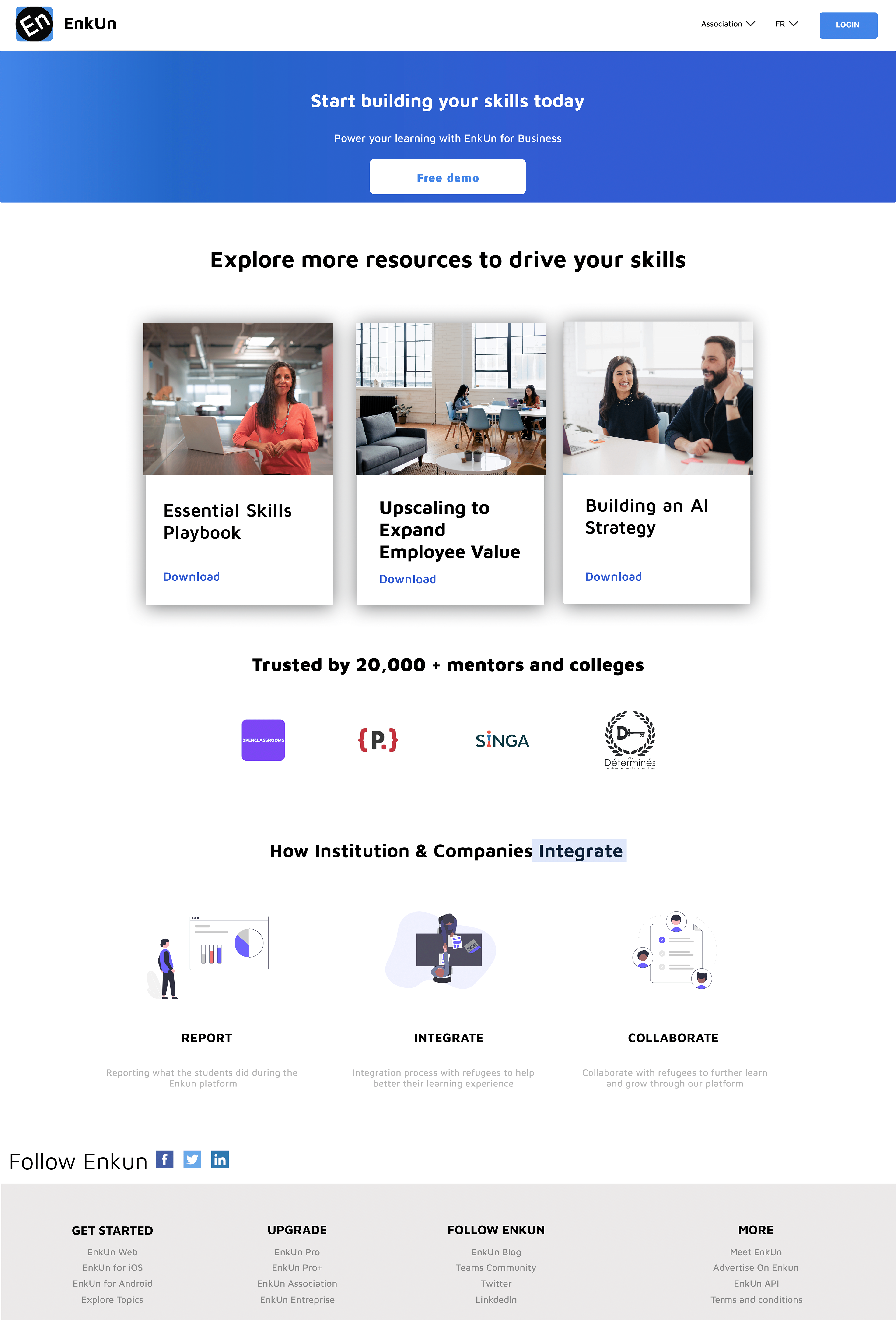
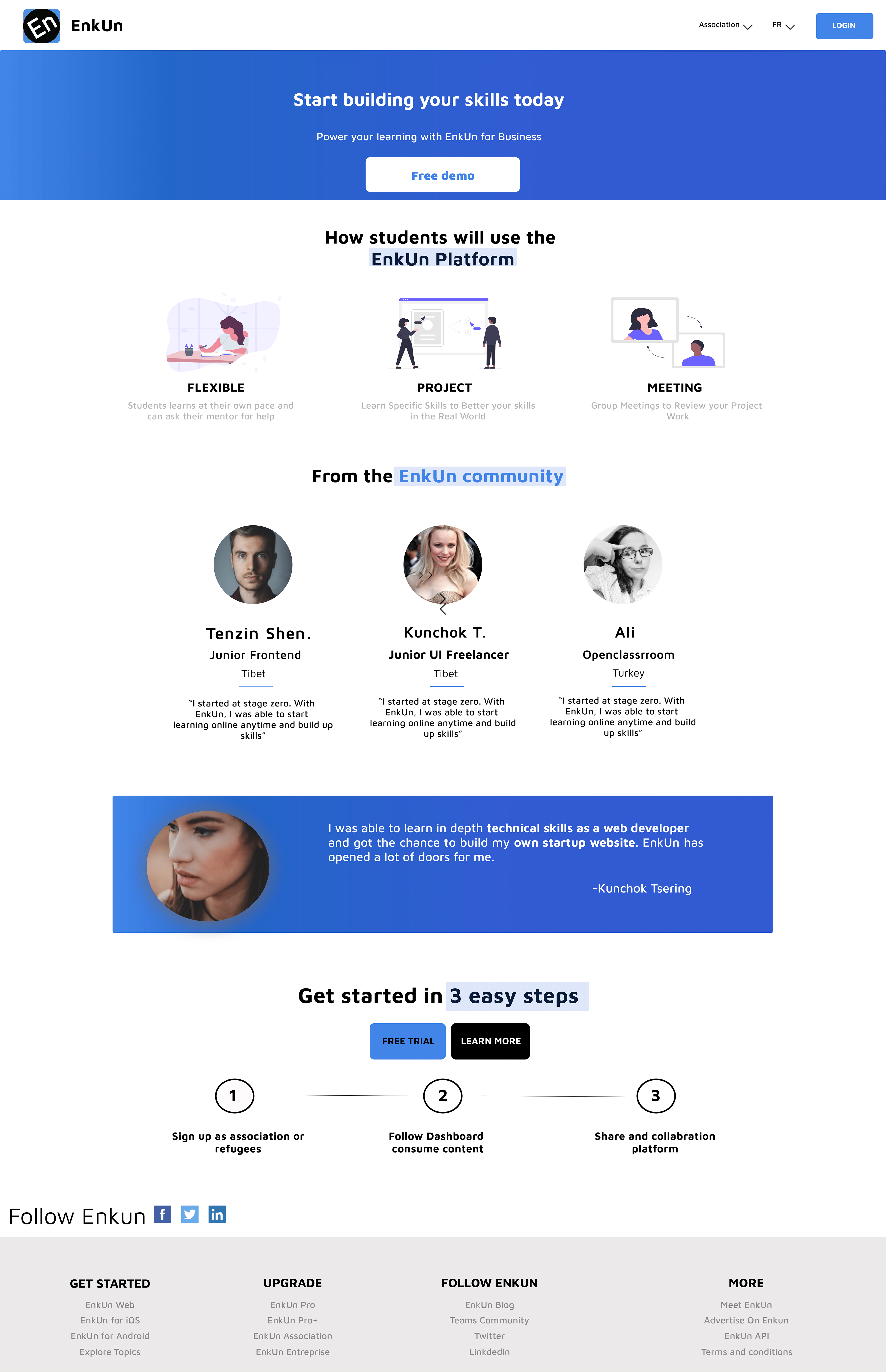
Inspired by both the existing landing page and online inspiration from websites like Behance and Dribbble, I created four digital low-fidelity wireframes to visualize the potential layout of the landing page. These wireframes focused on content placement, user flow, and the incorporation of visual elements that would convey EnkUn’s mission as a learning platform. With these wireframes as a foundation, I transitioned to high-fidelity prototypes in Figma.

1

2
3
4
Usability Testing
Once the high-fidelity prototypes were ready, I conducted usability testing to determine which version resonated most with users and the EnkUn team. Participants included a diverse group with varying levels of digital literacy and accessibility needs. They were asked to navigate the four prototypes and provide feedback on usability, design, and overall user experience. The testing revealed that users favored a design with clear, visual storytelling elements, such as images depicting learning and progress. The use of icons and infographics was particularly effective in communicating the site’s purpose to users with reading difficulties.
Result
The usability testing culminated in the selection of the most highly rated landing page design, which was then adopted as EnkUn’s first official landing page. The final design successfully addressed the needs of the target audience, incorporating feedback from the usability tests to optimize user engagement and accessibility. This project not only resulted in a 50% improvement in project optimization and completion time but also set a new standard for future EnkUn projects. The positive outcomes demonstrated the effectiveness of applying UX Best Practices and adhering to web accessibility standards, ultimately creating a more inclusive and user-friendly platform.
Takeaways
Although there were suggestions for refining other components, we decided to move forward with this design to ensure that EnkUn has a live website that effectively represents the company. This project, being my first at EnkUn, is especially meaningful as it marks the first design to be published under the EnkUn brand. While it may not be perfect, it serves as a solid foundation. From here, we plan to continually grow and improve the site, building on this initial launch to better serve our users and achieve our mission. I’m excited to keep refining and enhancing the look and functionality of EnkUn, and I’m committed to evolving the platform as we gather feedback and learn more about our users' needs.